


Project Title
Kotak Cherry
Platform
Native Mobile Application (iOS and Android)
Tags
UX Design
Fintech
Forex
About
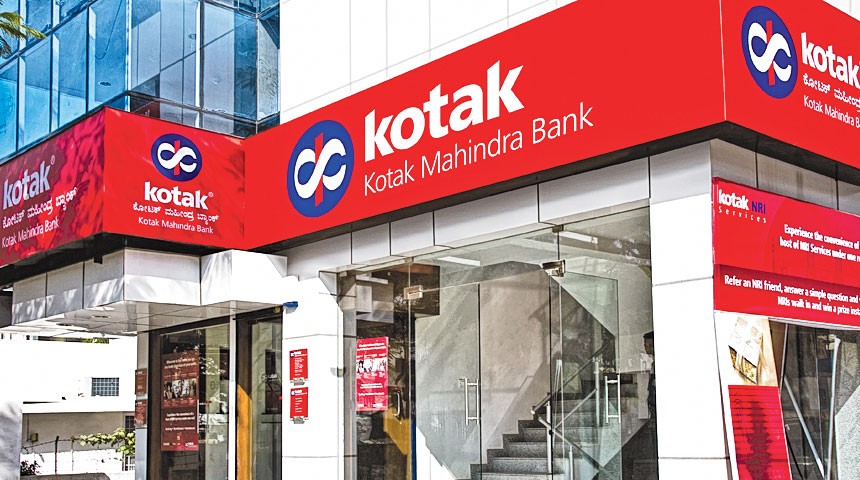
Established in 1985, the Kotak Mahindra Group is one of India’s leading financial services conglomerates. KMFL became the first non-banking finance company in India to become a bank – Kotak Mahindra Bank Limited.
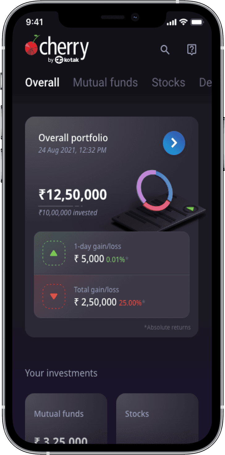
Kotak Cherry is a one-stop investment app that helps you to invest in Mutual Funds, Bonds, Stocks, ETFs, and Index Funds. It is an intuitive platform backed by the trusted house of Kotak.


Ask
Redesign the Kotak Cherry UI to attract a younger user base.
Must have:
🚀 Have 3D elements/icons in the design language.
🚀 Have a light mode and a dark mode.
🚀 Should have game-like feel in terms of the User interface.
Design Research
About the Research
To gain valuable insights and understand the preferences and needs of our target audience, I employed a mixed-method approach, which included conducting a survey, performing a competitive analysis, creating user personas, and utilizing affinity mapping. This comprehensive research strategy allowed us to gather diverse perspectives and identify potential pain points and opportunities in the payment app domain.
Overall, this comprehensive research approach provided us with valuable insights into our potential users' preferences and pain points when using payment apps, fintech products, and forex apps.

User Survey
About the Survey
This survey's outcomes suggest that a portion of the users are displeased with Kotak Cherry's overall design and user experience, yet they find it simple to navigate. Nonetheless, a substantial number of users face technical problems when using the app, and customer assistance is deemed average or subpar.
This input can be utilized to enhance the app and tackle any concerns users have pointed out.
Findings
Research Findings
After thorough user analysis including survey feedback and competitive evaluations, we identified various essential elements to be taken into account throughout the brainstorming and development stage.
User Insights
Younger Users are very dissatisfied with the User Interface of the app

Pain points
Users Find it harder to navigate through the application.
Must-have Requirements
Needs a more contemporary User Experience
Other issues
Not optimised for mobile and needs to be responsive
Ideation
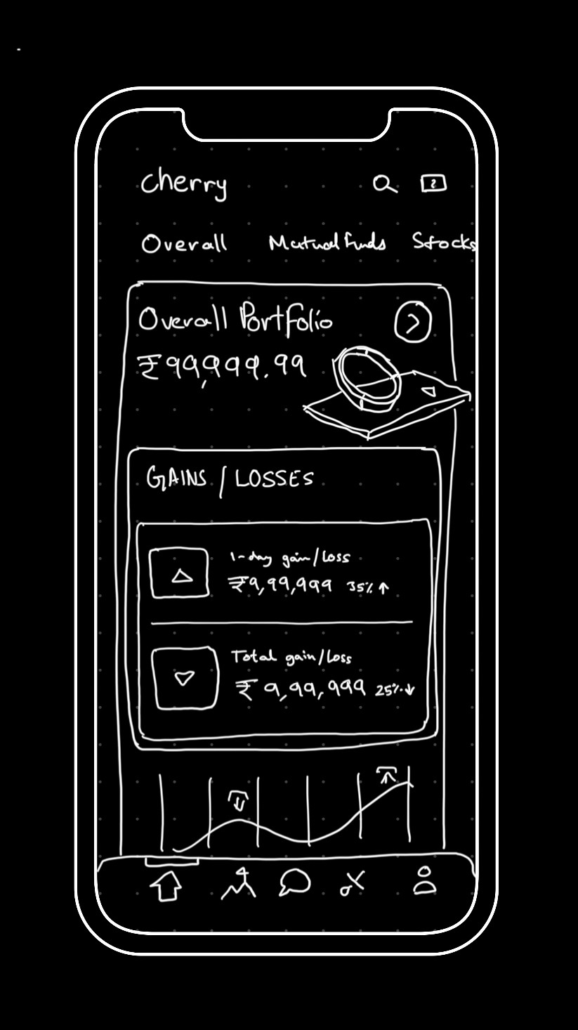
Ideation Sketches
After gaining several valuable insights from the user survey, I was able to create several ideation sketches that tackle user needs and improve the overall User Experience.
Here are a few ideation sketches for the mobile application:
3D modelling Process
Ideation Sketches
Our team has chosen to incorporate 3D elements into our advanced User Interface. With my background in 3D modelling, I was able to create these components using Blender.
Here is a glimpse at some of the elements and the corresponding Blender project file:


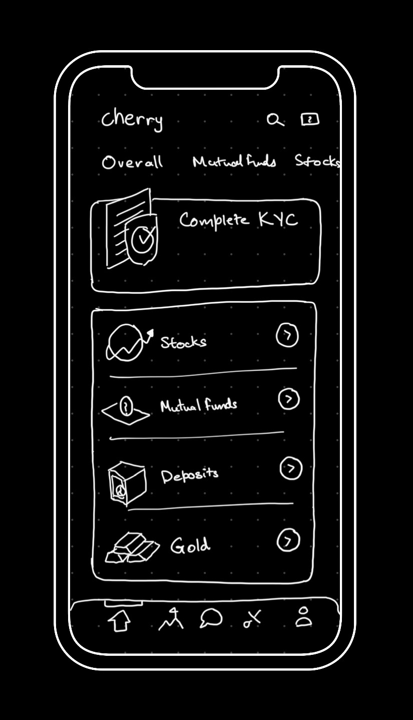
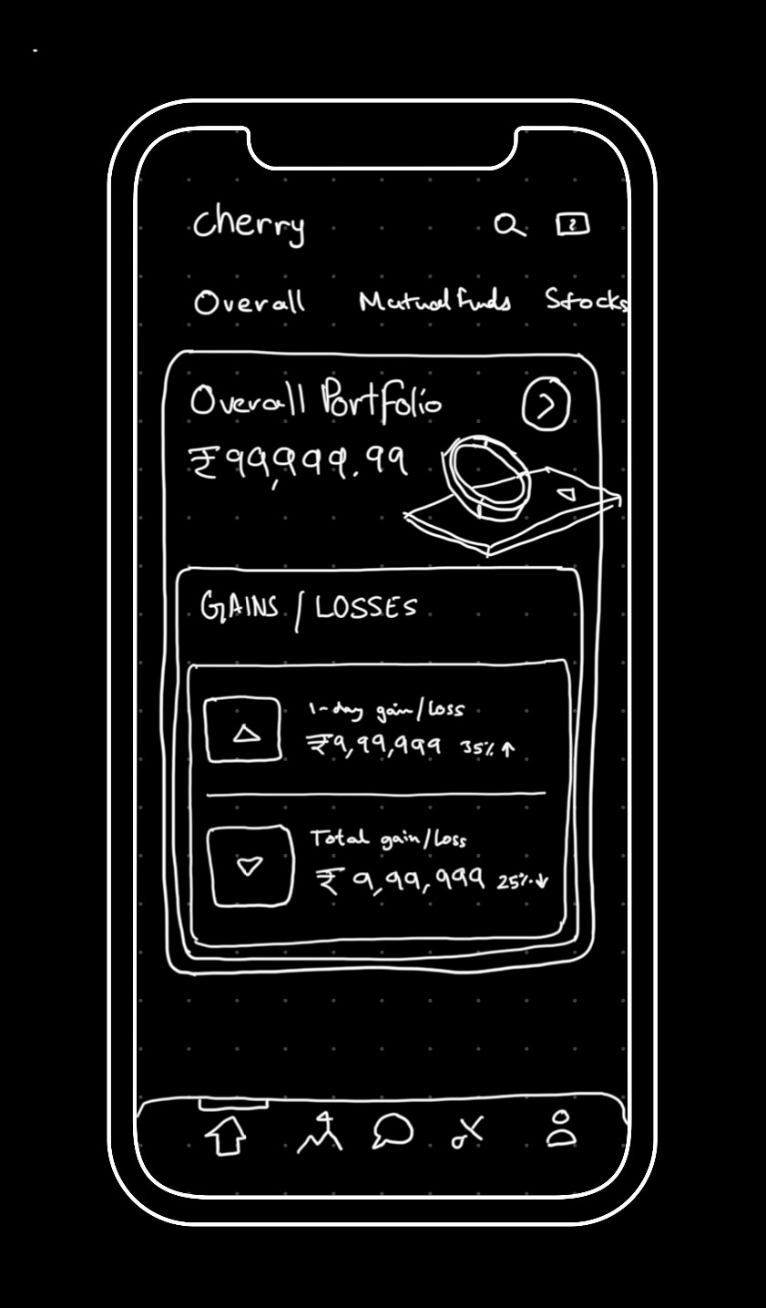
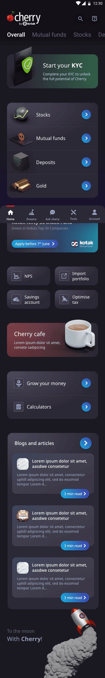
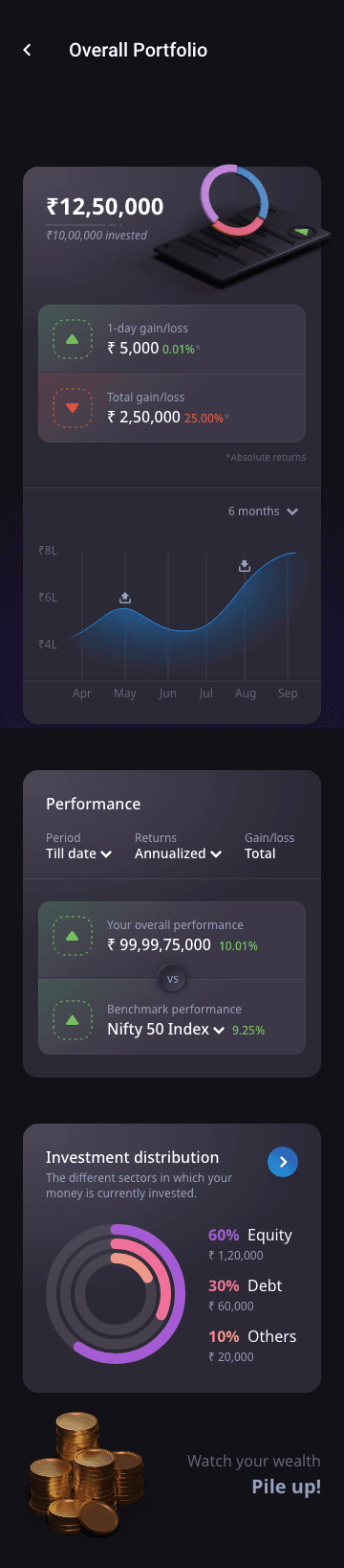
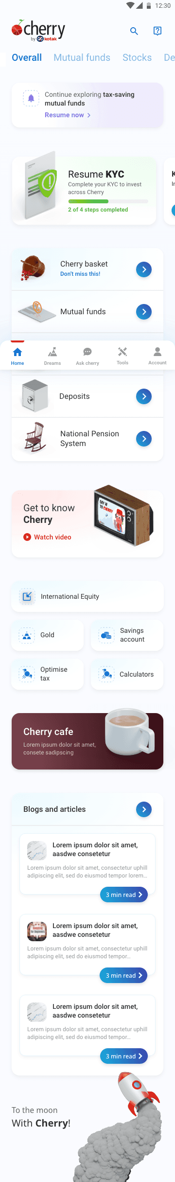
Wireframes
About the wireframes
After completing the 3D components, I began integrating them into high-fidelity wireframes, drawing inspiration directly from the ideation sketches.
Displayed below are two high-fidelity wireframes for both mobile and web applications:


Before


Outcomes
Project Outcomes
This undertaking provided me with significant insights into the world of investment banking and its clients. It presented an exhilarating challenge, allowing me to address the demands of emerging investors. The user interface garnered praise from users, and due to comprehensive User research, the overall experience mirrored other currency trading applications, ensuring a smooth onboarding, navigation and usage journey.
This project showcases these indicators of success:
Increased Users
Growth of 40% in young users aged 18–25 years old

Bounce Rate
Up to 2x lower bounce Rate via the mobile app

Customer Satisfaction
Customers reported user-friendly browsing
